Ivan Chermayeff’s Enduring MoMA Logo: A Masterclass in Typographic Design
A look back at Ivan Chermayeff's iconic 1964 logotype for the Museum of Modern Art, its design principles, and its lasting impact on the museum's visual identity.
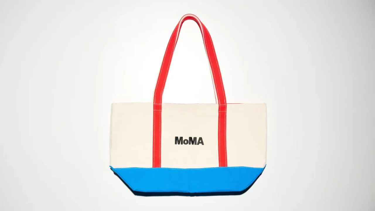
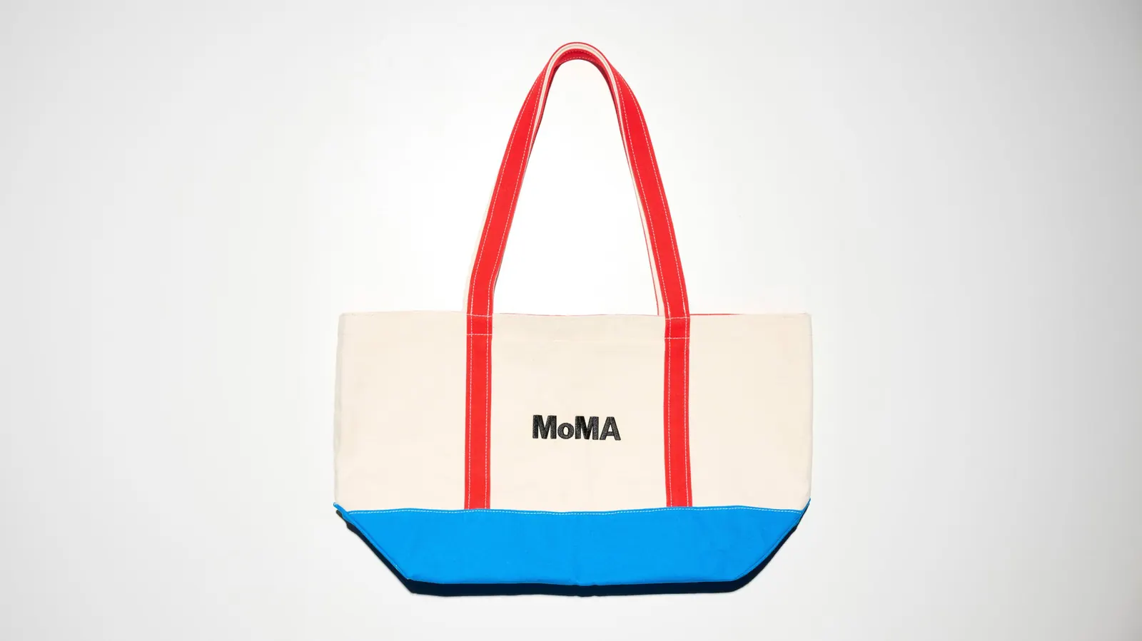
Ivan Chermayeff’s distinctive logotype for the Museum of Modern Art (MoMA), first introduced in 1964, remains a powerful example of typographic design that has stood the test of time. Its enduring presence and effectiveness underscore Chermayeff’s mastery of graphical simplicity and intellectual rigor in branding.
Early Design Principles
Crafted using Franklin Gothic No. 2, Chermayeff’s design embraced a starkly typographic approach. This choice was a deliberate move towards a modern aesthetic, prioritizing clarity and impact through letterforms alone. Chermayeff, the son of modernist architect Serge Chermayeff, brought a sophisticated understanding of form and function to his wide-ranging career, which spanned graphic design, branding, writing, and design theory. His work for institutions like Barneys New York and Chase Bank cemented his reputation for creating memorable and enduring visual identities.
Evolution and Adaptation
While Chermayeff’s original design proved remarkably resilient, MoMA’s visual identity has seen further evolution. In 2004, a custom typeface named MoMA Gothic was introduced, developed by the renowned typographer Matthew Carter. Five years later, the design consultancy Pentagram was commissioned to create comprehensive guidelines for the use of MoMA Gothic across all aspects of the museum’s visual output, from signage and publications to promotional materials. Working in close collaboration with Julia Hoffmann, MoMA’s Creative Director for Graphics and Advertising, Pentagram developed strategies for adapting the logo through cropping, coloring, and integration with content, effectively reducing it to an abstracted set of letters.
A Visual Shorthand for High Art
The success of Chermayeff’s original logotype lies in its ability to serve as a potent visual shorthand for “high art.” It masterfully connects bold graphical simplicity with intellectual rigor, a duality that allows it to comfortably accommodate diverse artistic expressions, from the vibrant energy of Pop Art to the restrained elegance of Minimalism. This inherent flexibility has ensured its continued relevance and application.
Enduring Foundation
Over six decades after its inception, Chermayeff’s 1964 design remains the foundational element of MoMA’s visual identity. Its presence is ubiquitous, appearing on everything from the museum’s 53rd Street façade to its website and a wide array of merchandise. The logotype’s clean, impactful design ensures it functions seamlessly across these varied platforms, a testament to its timeless appeal and Chermayeff’s visionary approach.
Key facts
| Aspect | Detail |
|---|---|
| Designer | Ivan Chermayeff |
| Year Introduced | 1964 |
| Typeface | Franklin Gothic No. 2 |
| Subsequent Type | MoMA Gothic (2004) by Matthew Carter |
| Current Guidance | Pentagram (2009) |
The enduring legacy of Ivan Chermayeff’s MoMA logo highlights the power of thoughtful typographic design in establishing a strong and lasting brand identity for cultural institutions. Its ability to evolve while retaining its core essence speaks to the fundamental strength of Chermayeff’s original vision.
Source: Wallpaper – Anatomy of a logo: MoMA by Ivan Chermayeff, https://www.wallpaper.com/design-interiors/corporate-design-branding/moma-logo-design
Source
Wallpaper Original publication: 2026-07-12T12:00:00+00:00
Related news
Christopher Kane brings streamlined, heritage-driven vision to Mulberry in London Fashion Week debut
The Scottish designer presented his first collection for the British leather goods house at London Fashion Week, blending sharp tailoring, archival references…
Read more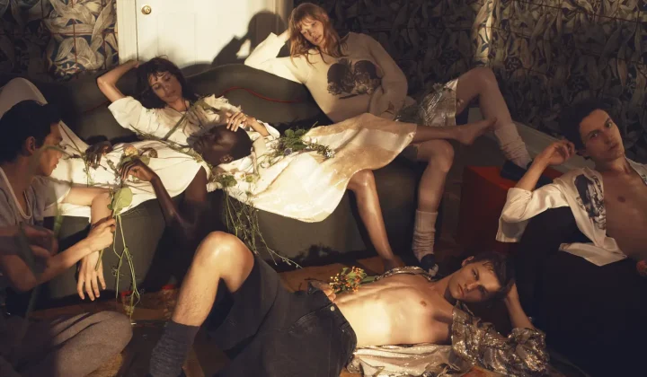
When Film Directors Become Interior Designers: Guadagnino, Lynch, Anderson and Almodóvar Step Off Screen
From Luca Guadagnino’s Zara Home collection to David Lynch’s Paris club and Wes Anderson’s train carriage, a wave of collaborations is blurring…
Read more
Jesus Mari Lazkano Examines Changing Landscapes Through Painting and Animated Film at Basque Luxury Studio
The Basque artist’s exhibition ‘Azken Natura’ brings together six large-scale paintings and a 22-minute animated film that traces the melting of the…
Read more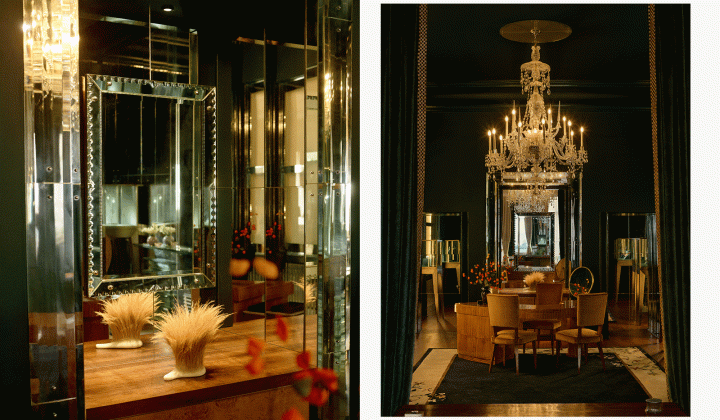
Glenn Spiro opens intimate jewellery atelier in Mayfair with designer Valerie Name Bolaño
The London jewellery house’s new boutique at 26 Bruton Street blends antiques, bespoke furniture and a monochrome palette to create a residential…
Read moreRelated wiki
Adaptive Reuse in Architecture
Reference page for reuse, retrofit, conversion, embodied carbon and design constraints.
Read more