Festival Lineup Posters Embrace Ambiguity in Design
As music festivals increasingly move away from traditional hierarchical designs, emerging trends favor abstract and unconventional formats that challenge legibility, driven by complex artist negotiation dynamics and a desire for unique visual identities.
The visual landscape of music festivals is undergoing a significant shift, with lineup posters increasingly eschewing traditional, easily decipherable formats for more abstract and ambiguous designs. This trend, driven by complex artist negotiation processes and a desire for distinctive branding, is leading to posters that are becoming harder for attendees to interpret at a glance.
The Power of the Poster
For many music festivals, the lineup poster drop is as significant an event as the opening day. It often serves as a primary driver for ticket sales, acting as the initial visual representation of the festival’s offerings. Historically, these posters have employed various methods to convey artist importance. Some, like Coachella, gradually decrease font size to indicate an artist’s stature, while others, such as Lost Lands, use distinct blocks of text for headliners versus emerging acts. Tomorrowland, with its extensive roster, opts for a purely alphabetical listing with uniform font sizes.
A New Design Paradigm
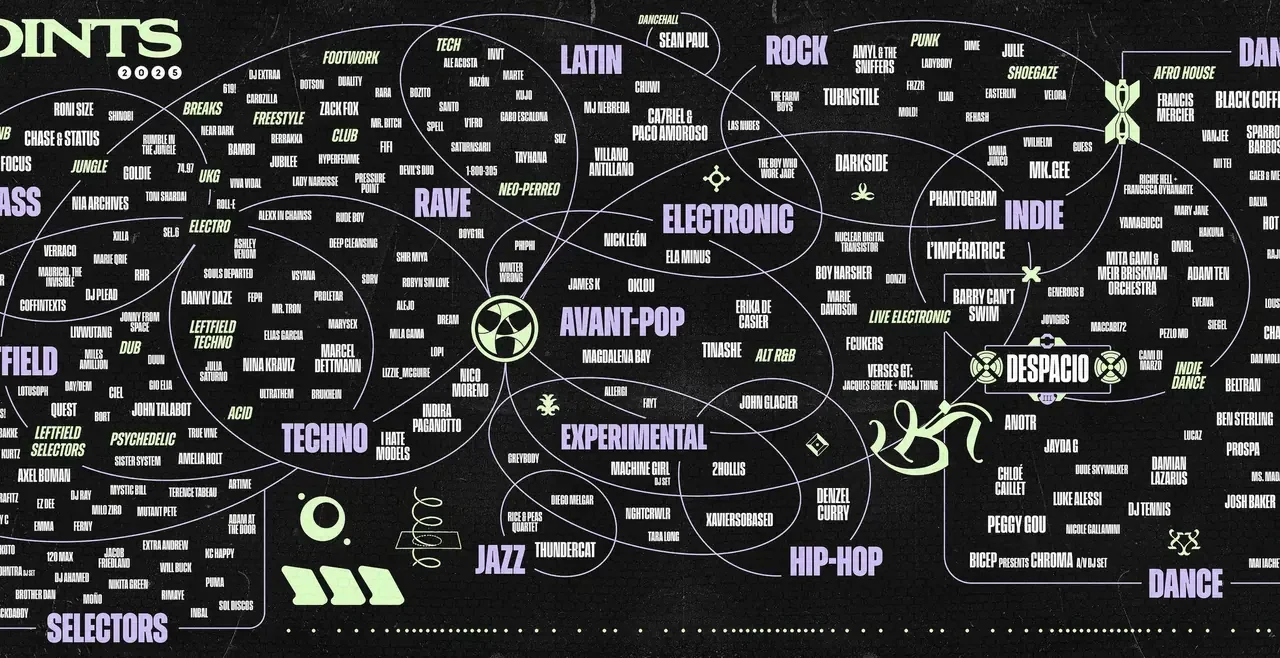
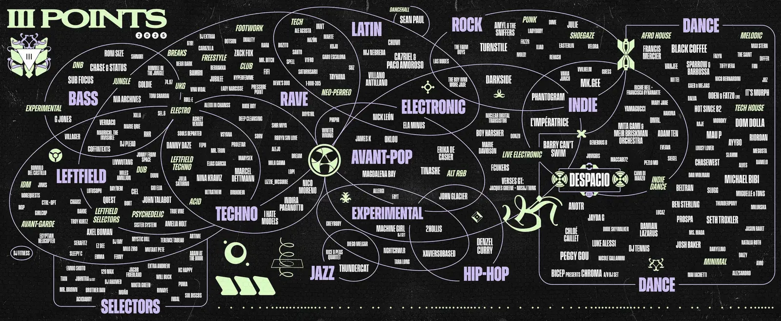
However, festivals like Miami’s III Points are experimenting with radical departures. For the past two years, III Points has featured a circular design, with artist names placed within the central circle, on the curved frame, or outside it, with the smallest names listed horizontally at the bottom. Santi Vidal, Talent Buyer for III Points, who also designs the posters, describes this as reinventing “what billing means.”
Vidal explains that the primary goal of lineup posters is to highlight top talent while remaining legible enough for audiences to dissect. Yet, the growing adoption of non-traditional designs by other major festivals suggests a broader movement. Camp Flog Gnaw, for instance, adopted a crossword puzzle format in 2024, while HARD Summer and Portola opted for a more graffiti-inspired aesthetic, moving away from sequential sizing and uniform fonts. Vidal notes that these festivals are, in his view, adopting a similar approach to his own, where the order and prominence of artists are intentionally obscured.
Easing Negotiation Pressures
The ambiguity in these designs is not merely an aesthetic choice; it serves a practical purpose in the often-stressful world of festival bookings. Vidal reveals that the primary driver behind these less hierarchical layouts is to alleviate the pressure of negotiations with artist agents. “Billing can be the most stressful part of festival bookings,” he states, as agents naturally push for their artists to be featured prominently.
The circular design of III Points, for example, creates ambiguity by avoiding a single clear headliner. “You’re either in the circle or [not]. The font sizes are the same. They don’t know what’s better than what,” Vidal explains. This allows him to group top acts within the circle as co-headliners and those on the rings as sub-headliners, without a definitive ranking. This approach sidesteps the traditional Coachella-style hierarchy, which, while clear, can become a point of contention as artists’ popularity can surge rapidly due to social media and streaming, making static rankings difficult to maintain.
Balancing Artistic Curation and Agent Satisfaction
Beyond the practicalities of negotiation, these unconventional designs allow festival organizers to exercise more creative control over their lineups and visual identity. Vidal admits his preference for posters that offer a sense of hierarchy, allowing him to discover more obscure artists at the bottom of the list, aligning with his “niche taste.”
The challenge lies in balancing the desire to create a lineup and poster that resonates with the organizer’s vision with the need to satisfy artist agents, who are crucial for securing performances and driving ticket sales. This “balancing act” can be tedious, and unique design choices offer a creative outlet to manage these complexities.
Beyond the Poster: Artist Discovery Tools
Once the negotiations are complete and the poster is released, Vidal goes a step further by creating a “music map.” This secondary graphic uses overlapping Venn diagrams to arrange all booked artists by genre, serving as a cheat sheet for attendees to discover new music based on their existing preferences. This innovative approach aims to enhance the attendee experience by providing deeper insights into the lineup beyond initial visual appeal.
Key facts
| Aspect | Detail |
|---|---|
| Trend | Festival lineup posters embracing abstract/ambiguous designs |
| Driving Factors | Artist negotiation ease, unique branding, rapid artist popularity shifts |
| Example Festivals | III Points, Camp Flog Gnaw, HARD Summer, Portola |
| Mitigation Tool | “Music map” using Venn diagrams for genre-based artist discovery |
This evolution in festival poster design reflects a broader trend in visual communication, where clarity is sometimes sacrificed for strategic advantage and artistic expression. For attendees, it means engaging more deeply with the lineup and potentially discovering new artists through supplementary tools.
Source: Why are festival line-up poster designs getting so hard to read? – Wallpaper (https://www.wallpaper.com/art/why-are-festival-line-up-poster-designs-getting-so-hard-to-read)
Source
Wallpaper Original publication: 2026-06-14T08:00:00+00:00
Related news

Professional Floor Plan Drafting Services Crucial for U.S. Building Permits and Projects
Homeowners and contractors in the U.S. need to understand the necessity of accurate floor plans for building permits, renovations, and new constructions.…
Read more
Tom Sachs Embraces Imperfection in New Ceramics Exhibition at Salon 94
Tom Sachs' latest exhibition, "Furniture" at Salon 94, showcases ceramic works that highlight breakage, repair, and the visible language of craft, alongside…
Read more
MIT Museum Acquires Extensive Archive of Pritzker Prize-Winning Architect I. M. Pei
The MIT Museum has secured the comprehensive career archive of architect I. M. Pei, an MIT alumnus, adding over 1,500 architectural drawings,…
Read more
Crosby Studios Transforms NYC Space for World Cup Exhibition
New York-based Crosby Studios has designed a vibrant pop-up exhibition space in Manhattan, coinciding with the 2026 FIFA World Cup and featuring…
Read moreRelated wiki
Adaptive Reuse in Architecture
Reference page for reuse, retrofit, conversion, embodied carbon and design constraints.
Read more