Vokrug Podrug Café and Concept Store Opens in Penza with Distinctive Pink Palette
QUADRUM STUDIO unveils Vokrug Podrug, a dual-function space in Penza, Russia, featuring a café and concept store designed to evoke a "Pink Narnia." The project emphasizes a strong female creative team and integrates with a historic building's existing structure.
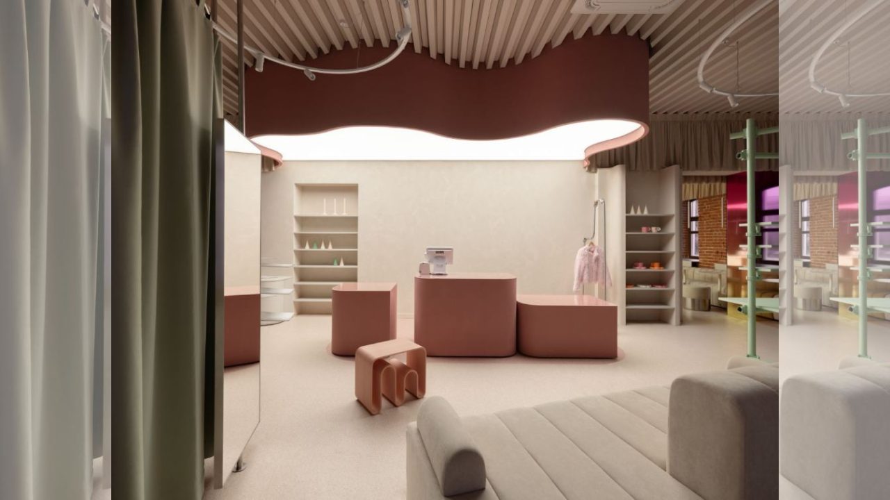
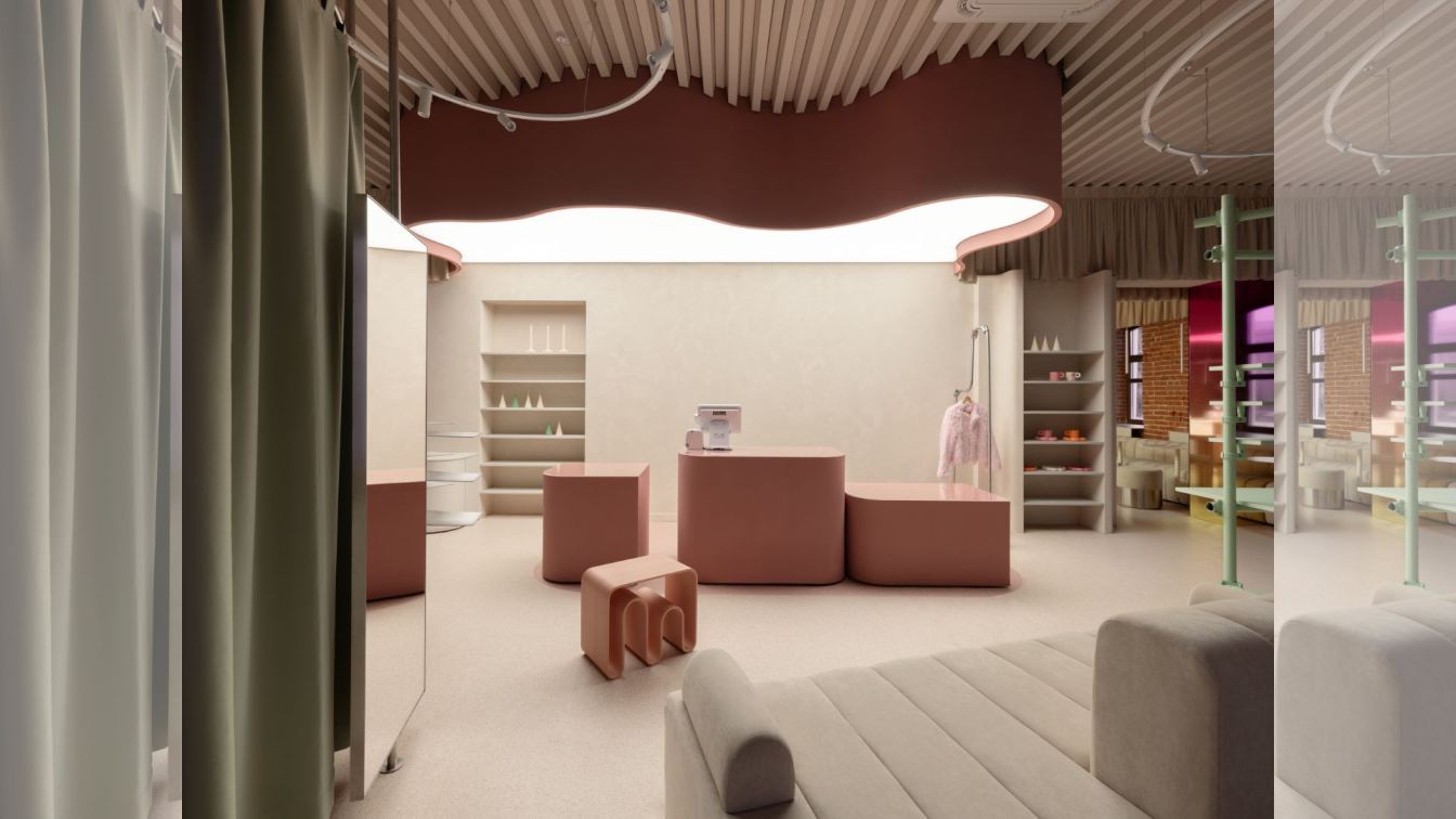
QUADRUM STUDIO has completed Vokrug Podrug, a distinctive café and concept store located in Penza, Russia. The project, which occupies a historic building designated as part of the city’s cultural heritage, is characterized by its pervasive use of pink hues, aiming to create an immersive environment described by the studio as a “Pink Narnia.” A significant aspect of the project’s narrative is the composition of its team; 99% of the project’s contributors, including designers, coordinators, contractors, and the brand’s founders, are women.
The Vokrug Podrug space is divided into two interconnected zones: a café area and a local brand concept store. The design had to respect the building’s original brickwork, which could not be altered. Initially, the connection between the two spaces was a single, closed passage. The intervention involved creating a new passage to link the café and the concept store, aligned with the axis of the store’s entrance. This new connection facilitates a flow between the two distinct but related functions.
Why it matters
At the heart of both the café and the retail area, a unified counter serves as both the café bar and the retail checkout desk, visually bridging the two zones and acting as a central organizing element. Within the concept store, a fitting room is discreetly integrated. It is enclosed by textile panels in a matcha green hue, which also complements the central shelving units, providing a subtle color contrast to the dominant pink.
The interior features tinted mirrors with a pink gradient applied to the main walls, enhancing the immersive color experience. The café counter and retail checkout have been composed of multiple volumetric elements. The café bar itself is finished with glazed surfaces that transition from white to a soft blush. Above the work areas, a luminous ceiling is designed to resemble a “clouded sky,” further unifying the two spaces and adding a diffused light quality.
Context
Geometric rhythms are introduced throughout the interior. A multi-tiered shelving unit, secured with clamps, adds a dynamic, repetitive pattern. Geometric forms are also embedded in the architectural elements, such as a slatted ceiling and shelving units that appear to emerge organically from wall niches.
Several notable details contribute to the project’s unique character. These include a sink crafted from colored concrete, playful heart motifs incorporated into the stainless-steel belts of the poufs, and the use of colored mirrors. The furniture selected for the space is sourced from the Russian brand Eburet, known for its striking forms and commitment to using recycled materials. This choice underscores a broader design philosophy that blends aesthetic innovation with sustainable practices.
The integration of the Vokrug Podrug project within a historic building presents a dialogue between contemporary design and existing architectural heritage. The constraint of preserving original elements like the brickwork has led to creative solutions in spatial organization and material application. The design’s emphasis on a specific color palette and its intentional team composition offer a narrative of empowerment and focused creative vision. The project’s impact lies in its ability to transform a historically significant site into a vibrant, contemporary destination that caters to a specific brand identity and customer experience. For architects and designers, Vokrug Podrug serves as an example of how to approach renovations of heritage buildings with sensitivity and inventiveness. The use of colored concrete, recycled materials, and custom lighting demonstrates a thoughtful approach to material selection and atmospheric design. For local communities and businesses, such projects can revitalize urban areas and contribute to the cultural landscape by blending retail, hospitality, and design.
Key facts
Project Name | Vokrug Podrug
Location | Penza, Russia
Studio | QUADRUM STUDIO
Project Type | Café and Concept Store
Completion Year | Not specified in source
The design approach for Vokrug Podrug offers a case study for adaptive reuse in historically sensitive contexts. The project’s success hinges on its ability to create a strong thematic identity through color and material, while respecting the original structure. The emphasis on a female-led design team adds a layer of social and professional commentary to the project, highlighting diverse contributions in the field of architecture and design. The integration of furniture from a brand utilizing recycled materials also points towards a growing trend in sustainable sourcing within interior and retail design. The project’s dual nature as a café and a retail space creates a dynamic environment for patrons, encouraging longer stays and deeper engagement with the brand. The careful consideration of lighting, from the luminous ceiling to the colored mirrors, plays a crucial role in defining the atmosphere and enhancing the visual experience of the “Pink Narnia” concept.
Source: Amazing Architecture (https://amazingarchitecture.com/store/vokrug-podrug-penza-russia-by-quadrum-studio)
Key facts
- Source: Amazing Architecture
- Date: 2026-05-26T03:21:31+00:00
- Topic: Vokrug Podrug, Penza, Russia by QUADRUM STUDIO
Source
Amazing Architecture Original publication: 2026-05-26T03:21:31+00:00
Related news
India’s ‘Anthill’ House Mimics Insect Mounds for Passive Cooling
A new residential project in India draws inspiration from the natural ventilation and thermal regulation of anthills, utilizing brick chambers and cavernous…
Read more
How to Read Project Changes in Architecture and Urban Design
A reliable project analysis starts by checking what version of a scheme you are looking at, what documents support it, and which…
Read more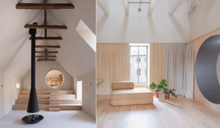
Atelier AJO Transforms Vacant French Farmhouse into a Family Gathering Retreat
A once-vacant farmhouse in Pont-de-Salars, France, has been revitalized by Atelier AJO, creating a dynamic and welcoming space for family and friends,…
Read more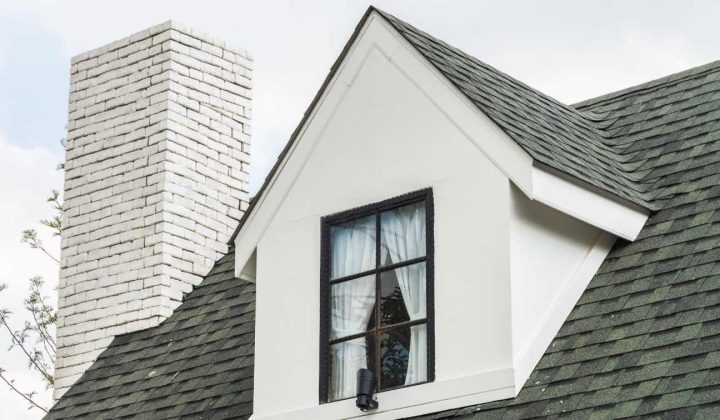
Jefferson OH Homeowners Guide to Roof Replacement: Key Considerations for Durability and Value
A comprehensive overview for Jefferson, Ohio homeowners on essential factors to consider before undertaking a roof replacement project, from material selection to…
Read moreRelated wiki
Adaptive Reuse in Architecture
Reference page for reuse, retrofit, conversion, embodied carbon and design constraints.
Read more