
PollenNav app redraws city routes around what you can breathe, not just where you can walk
A navigation app designed by Yani Shi treats pollen exposure as a routing variable, offering allergy sufferers block-level air-quality information instead of a single city-wide forecast.
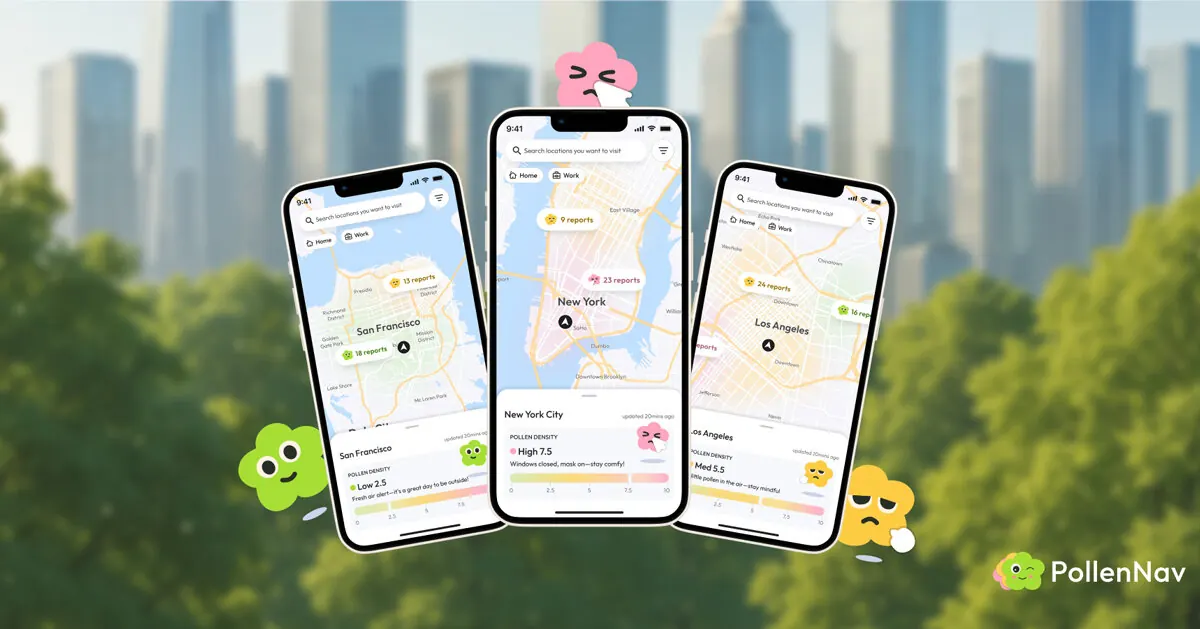
Most navigation apps optimise for time, distance, or traffic. PollenNav asks a different question: which route will least likely leave you struggling to breathe? Designed by Bay Area product designer Yani Shi with collaborators Yawen Zheng, Ziqi Li, and Chang Mou, the app treats pollen exposure as a routing variable, as real to an allergy sufferer as a road closure is to a driver. The project has been recognised with the iF Design Award 2026, the Red Dot Award: Brands & Communication Design, a Silver at the New York Product Design Award, and the European Product Design Award.
How PollenNav works
Where conventional pollen forecasts stop at a single city-wide number, PollenNav works at the scale people actually move through: the block. It merges official readings from the National Weather Service with symptom reports submitted by users on the ground, cross-checking the two so the map reflects conditions as they are, not as a regional average predicts. An onboarding questionnaire tunes everything to the individual; someone reactive to grass and someone reactive to birch see the same street rendered differently.
That data surfaces as a colour-graded map, red through green, but the app’s more deliberate choice is how it handles tone. Health information about your own body is easy to make anxious; PollenNav instead assigns pollen levels to a set of flower characters whose expressions shift with the risk, so the interface reads as approachable rather than clinical. Paired with an Apple Watch, the system notices repeated sneezing and offers a one-tap way to log it, feeding the same community map the user relies on. A points system rewards those reports, which in turn sharpen the model’s read on which allergens dominate a given area.
Awards and recognition
The project has collected four design awards since its launch, including the iF Design Award 2026 and Red Dot Award: Brands & Communication Design. The formal recognition places PollenNav within the broader conversation about how mobile interfaces can address public health challenges without triggering user anxiety. The awards also signal growing interest among design juries in tools that merge environmental data with personal health, a trend that aligns with the rise of wearable health sensors and hyperlocal mapping.
Designer background
Yani Shi is a product designer at Lyft, where she leads experience design for the Verticals team across airport, scheduled-ride, and large-event transportation. She studied at UC Berkeley (M.Design) and previously worked at AKQA and Baidu, and sits on the jury for several international design awards. For her, PollenNav is less a health product than an argument about what navigation should be responsible for — the idea that a map might reasonably be expected to know something about the person reading it.
The premise is personal. Shi spent a stretch of 2021 dismissing her own allergy symptoms until they escalated into asthma, coughing through nights she couldn’t sleep. The recurring thought during that period — that she simply had no way of knowing where the allergens were — became the project’s starting point. Roughly a billion people worldwide share some version of that blind spot, navigating cities with tools that account for everything except the air.
Why it matters for cities
For architects, urban planners, and landscape designers, PollenNav points to an emerging expectation: that public space and mobility infrastructure should be legible not only in terms of distance and time but also in terms of environmental health. The same logic could extend to other hyperlocal metrics — heat, humidity, noise, or particulate matter — that affect how people experience streets and public spaces. The app’s block-level resolution suggests a shift from city-wide averages to microclimatic data, which has implications for green infrastructure placement, tree species selection, and pedestrian route planning.
Key facts
| Item | Detail |
|---|---|
| App name | PollenNav |
| Designer / team | Yani Shi (lead), Yawen Zheng, Ziqi Li, Chang Mou |
| Awards | iF Design Award 2026, Red Dot Award, NY Product Design Award (Silver), European Product Design Award |
| Core innovation | Block-level pollen routing using NWS data + user symptom reports |
Source: Designboom, “PollenNav mobile app maps the city by what you can breathe, not just where you can walk” — https://www.designboom.com/readers/pollennav-mobile-app-city-routes-allergies-yani-shi/
Source
Designboom Original publication: 2026-07-28T22:20:19+00:00
Related news
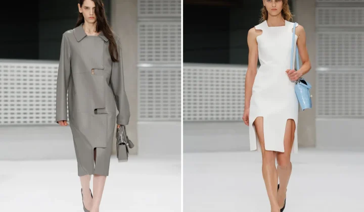
Christopher Kane brings streamlined, heritage-driven vision to Mulberry in London Fashion Week debut
The Scottish designer presented his first collection for the British leather goods house at London Fashion Week, blending sharp tailoring, archival references…
Read more
When Film Directors Become Interior Designers: Guadagnino, Lynch, Anderson and Almodóvar Step Off Screen
From Luca Guadagnino’s Zara Home collection to David Lynch’s Paris club and Wes Anderson’s train carriage, a wave of collaborations is blurring…
Read more
Jesus Mari Lazkano Examines Changing Landscapes Through Painting and Animated Film at Basque Luxury Studio
The Basque artist’s exhibition ‘Azken Natura’ brings together six large-scale paintings and a 22-minute animated film that traces the melting of the…
Read more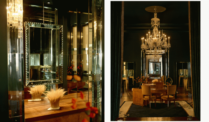
Glenn Spiro opens intimate jewellery atelier in Mayfair with designer Valerie Name Bolaño
The London jewellery house’s new boutique at 26 Bruton Street blends antiques, bespoke furniture and a monochrome palette to create a residential…
Read moreRelated wiki

Adaptive Reuse in Architecture
Reference page for reuse, retrofit, conversion, embodied carbon and design constraints.
Read more