
Andy Warhol’s Campbell’s Soup Can: A Deep Dive into Iconic Pop Art Design
Explore the iconic status of Andy Warhol's Campbell's Soup Cans, examining how the artist transformed a commonplace item into a Pop Art masterpiece, blurring the lines between commercial design and fine art.
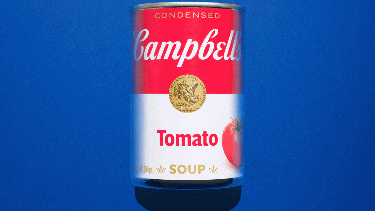
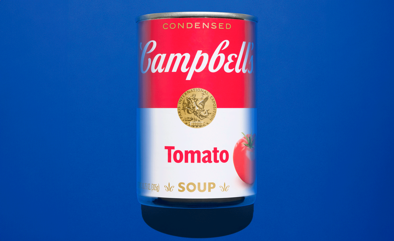
Andy Warhol’s enduring “Campbell’s Soup Cans” series, created between 1961 and 1962, represents a pivotal moment in art history, transforming a ubiquitous household item into a celebrated work of Pop Art. This iconic series, comprising 32 distinct canvases each depicting a different Campbell’s soup flavor, remains a powerful exploration of consumer culture, branding, and the very definition of art.
The Genesis of a Pop Art Masterpiece
Before achieving fame as a Pop Art icon, Andy Warhol honed his skills as a commercial illustrator in the 1950s. His early work for fashion advertising and magazines instilled in him a profound respect for consumer culture, a perspective that diverged from the prevailing artistic trends of the era. While Abstract Expressionism, championed by artists like Jackson Pollock and Mark Rothko, dominated the post-war art scene with its introspective and often energised explorations, Warhol recognized the potent communicative power embedded within logos and packaging.
Warhol’s choice to recontextualize and elevate the ordinary Campbell’s soup can was a deliberate departure from the abstract styles of the time. His figurative and concrete approach stood in stark contrast, inviting viewers to consider the significance of an object familiar to millions. The repetition inherent in the series, particularly when viewed as a collective, emphasized the can’s place within a larger system of mass production, mirroring the identity of the end consumer.
The Enduring Power of Campbell’s Design
The Campbell’s soup can itself was already a design classic by the 1960s. Its bold red and white color scheme, distinctive typography, and the gold medallion—symbolizing consumer trust—were instantly recognizable. The red served as an attention-grabbing element, while the white conveyed an assurance of cleanliness and quality. By the time Warhol turned his artistic gaze upon it, the can’s design had become one of the most iconic pieces of packaging in America, a clear testament to the growing influence of graphic design in a burgeoning consumer society.
Warhol’s genius lay in his recognition that packaging could transcend the mundane and evolve into a cultural symbol. By reproducing the can with remarkable fidelity, and without overt commentary, he prompted audiences to question the source of its significance. Was it the artwork itself, or the inherent effectiveness of the original package design that imbued it with such weight?
A Commentary on Mass Production and Consumption
The repetition across the 32 canvases was crucial to Warhol’s artistic statement. When displayed together, the works mimicked the visual of stacked cans on supermarket shelves, reinforcing the idea of mass production and consumption. This emphasis on repetition, while lending a sense of familiar reliability, also introduced an unsettling edge, prompting viewers to contemplate the very nature of individuality and uniformity in modern society. Warhol, by presenting this ambiguity without explicit critique or commendation, fostered a sense of unease, leaving the interpretation open to the viewer.
Blurring the Lines Between Art and Commerce
Warhol masterfully blurred the boundaries between commercial design and fine art, elevating a commercial product to the status of high art. This act presaged the increasing dominance of brands in society, foreseeing the power of a logo and a brand to potentially eclipse more traditional forms of art in influence. His work served as a catalyst, inspiring designers to increasingly appreciate how everyday objects shape visual experiences and highlighting the artistry embedded within commercial graphics.
The Campbell’s Soup Cans became a defining image of Pop Art, a movement that challenged the traditional separation between “high” and “low” culture. By embracing familiar motifs from popular culture—advertising, comics, and consumer goods—Pop Art asserted that everyday products were as valid a subject for artistic expression as religious iconography or historical scenes. Warhol’s iconic cans, in this context, offered a radical new vision of what contemporary art could be, remaining as accessible and provocative today as they were in the 1960s.
Key facts
| Aspect | Detail |
|---|---|
| Artist | Andy Warhol |
| Artwork Series | Campbell’s Soup Cans |
| Creation Period | 1961-1962 |
| Number of Canvases | 32 |
| Art Movement | Pop Art |
| Cultural Impact | Redefined art, elevated consumer branding, explored mass production |
Warhol’s exploration of the Campbell’s Soup Can continues to resonate, offering insights into the power of design, the dynamics of consumer culture, and the evolving definition of art. For readers interested in design, this series provides a foundational understanding of how commercial aesthetics can be reinterpreted and elevated to profound artistic statements, influencing generations of designers and shaping our visual landscape.
Source: Wallpaper – Anatomy of a logo: Andy Warhol’s Campbell’s soup can – https://www.wallpaper.com/art/design-history-andy-warhol-campbell-s-soup-can
Source
Wallpaper Original publication: 2026-07-04T13:00:00+00:00
Related news

Handwoven Teak and Cord Outdoor Seating Debuts from Masaya and Abril Zepeda
Nicaraguan furniture brand Masaya has introduced two new handcrafted outdoor chairs — a rocking chair and a lounge chair — designed by…
Read more
Place in Mind: Hendricks Churchill Launches Hospitality Group to Revive Historic Properties
The architecture and interior design studio Hendricks Churchill has launched Place in Mind, a new hospitality group focused on acquiring, restoring, and…
Read more
Adalberto Dias Architects Complete Restoration of Lisbon’s Patriarchal Cathedral and Archaeological Center
The restoration of the Sé de Lisboa by Adalberto Dias Arquitecto integrates a new archaeological center, preserved cloisters, and seven centuries of…
Read more
Vantieghem Talebi’s ‘House of Cards’ Brings Timber Geometry to Belgian Family Home
A new family house in Belgium by US- and Swiss-based practice Vantieghem Talebi uses a steeply pitched, card-house-inspired form clad in Douglas-fir…
Read moreRelated wiki

Adaptive Reuse in Architecture
Reference page for reuse, retrofit, conversion, embodied carbon and design constraints.
Read more